Monte-Carlo Gastronomy presented a challenge : staying true to the 20 years old event, while refreshing the art direction to attract more customers.
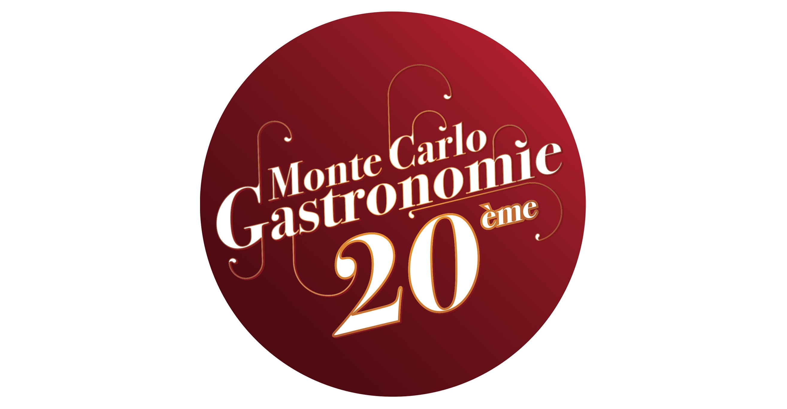
Monte-Carlo Gastronomie has been the leading gastronomy fair in the principality for over 20 years. For the 20th anniversary of this prestigious event, which brings together the best international producers, the first task was to completely transform the event's identity.
We therefore decided to play on arabesques echoing the Belle Époque architecture of the Monte-Carlo Opera House/Casino. Translating rounded shapes to recall the famous arabesques of Art Nouveau, this new identity was launched in 2015. These curves symbolise gourmet flavours intertwining elegantly. The circle symbolises the ring of this legendary venue, which has always hosted the event: the Chapiteau de Monte-Carlo, known as the ‘Chapiteau de Fontvieille’, in the Principality of Monaco. This same venue is also the setting for the Monte-Carlo International Circus Festival.
Regarding the artistic direction of this 20th edition, it was clear that we had to first target each population represented in Monaco: English, Italian, French and Russian, in order to make them feel involved. This campaign used comparisons to personify each product and create links, not only by rhyming the names with the products, but also by creating graphic references from one image to another: the green bow tie with the green garnish, the blue scarf with white dots with the neck of the wine bottle, etc.


